UTS | UX DESIGN PROJECT 2026
Simplifying Sustainable Living
ROLE
UX/UI Designer
TIMELINE
February - May 2026
TEAM
Solo Project
SKILLS
UX Research
User Interviews
Journey Mapping
Interaction Design
Visual Design
Prototyping
Usability Testing
OVERVIEW
What if saving energy didn't mean changing your routine?
As the sole UX/UI Designer on this academic project, I designed Flowry, a routine-aware energy assistant for families with children aged 0 - 5. Over one semester, I took the project from research through to a fully tested, high-fidelity prototype.
UX Research
Conducting desk research, observational site studies, and user interviews to understand household energy behavior.
Interaction Design
Iterating through 4 rounds of prototyping and user testing to find the right interaction model.
Visual Design
Developing a playful, accessible visual language that made energy decisions feel approachable rather than technical.
RESEARCH & PROBLEM
Why don't families save energy, even when they want to?
I began with desk research, a stakeholder map, observational site studies, and a semi-structured interview with a participant from the target user group: a work-from-home mother managing structured evening routines with a toddler.


Routines Drive Energy Use
Household energy use is embedded in fixed daily routines like cooking, bathing, and childcare. Evening periods concentrate energy use in a narrow window that is difficult to shift.
Comfort Comes First
Families consistently prioritised comfort and stability over optimisation. Cost savings were motivating, but not enough to justify disrupting a child's routine.
Flexibility Exists, But Only In Small Tasks
Laundry and dishwashing were flexible. Cooking, bathing, and bedtime were not. The opportunity lay in supporting small, manageable shifts, not large-scale behavior change.
Existing Systems Miss the Point
Competitor analysis showed that smart home systems focus on efficiency and pricing data but fail to account for the mental load and unpredictability of real family life.
These insights pointed to a gap: families weren't resistant to saving energy. They just lacked a system that worked within their lives rather than against them.
PROBLEM EVOLUTION
The problem statement didn't arrive fully formed.
Over six weeks, the problem statement evolved from a broad focus on reducing household energy usage toward something far more specific and human-centred, shifting from "households" to "families with children aged 0 – 5," and from "reducing energy" to "maintaining comfort and simplifying routines."
This evolution reflected a transition from system-centred thinking toward a genuine understanding of household behavior and shaped every design decision that followed.
"How might we guide families to shift flexible household energy tasks for families with children aged 0 - 5 so that they can reduce electricity costs, maintain home comfort, and simplify evening routines?"
UNDERSTANDING THE USER
Designing not for a generic household, but for parents like Jane.
To ground the design in real behavior, I developed a persona, journey map, and written scenario based on my research participant. Jane Rahman is a work-from-home marketer, 32, living with her husband and 2-year-old daughter in suburban Sydney.

Her evenings revolve around a fixed window of childcare, cooking, and bedtime. She is aware electricity prices vary throughout the day but finds it impossible to act on that information when her daughter's comfort is the priority.
"If it affects my child's comfort or sleep, I wouldn't change it. That's my priority."
The journey map revealed that the greatest opportunity for energy intervention wasn't during high-stress cooking or bath time; it was during low-pressure moments after the child was asleep, when Jane was relaxed and open to small decisions.
DESIGN DIRECTION
Guidance over automation. Flexibility over control.
After Crazy 8 brainstorming, I developed three initial concepts: an Energy Routine Timeline, Micro-Suggestions via lock screen nudges, and a Routine-Aware Energy Assistant. Each addressed the research differently.
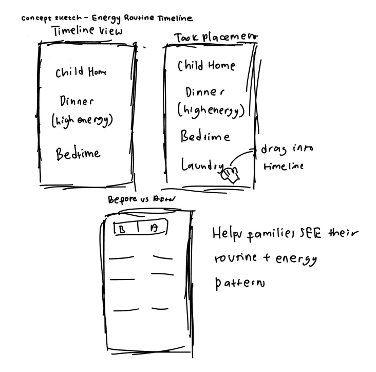
Concept 1 - Energy Routine Timeline
Made routines and energy patterns visible side by side. Benefits: helped users see flexible moments. Pain points: too much manual planning, added cognitive effort.

Concept 2 - Micro-Suggestions
Delivered simple prompts during low-stress moments. Benefits: low effort, easy to understand. Pain points: too passive, easy to ignore.

Concept 3 - Routine-Aware Energy Assistant
Personalised scheduling aligned to family routines. Benefits: reduced effort, supported savings. Pain points: too many setup steps, automation reduced user reassurance.
Peer feedback revealed a consistent theme: users wanted guidance, not full automation. They wanted control over decisions, not to be handed off to a system. This anchored the design direction for every iteration that followed.
ESTABLISHING CLARITY
Could users understand what this app actually did?
The first lo-fi prototype introduced calendar scheduling, task suggestions, savings information, and profile customisation. Testing with users revealed three core issues: empty states gave no guidance, savings information felt abstract, and navigation between screens was confusing.
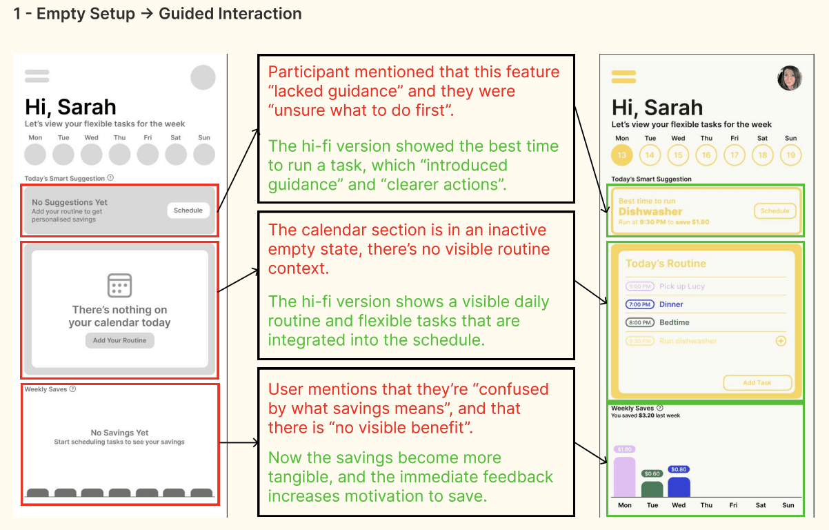


Empty Setup → Guided Interaction
Introduced visible routine context and clearer onboarding so users immediately understood what action to take.
Hidden Savings → Tangible Feedback
Made savings concrete and immediate to increase motivation rather than displaying abstract numbers.
Low Visibility Navigation → Clearer Hierarchy
Improved tab visibility and setting clarity so users could scan and navigate with confidence.
IMPROVING VISIBILITY
Small visual changes, significant usability gains.
The second iteration introduced stronger colour contrast, larger typography, and draggable flexible tasks. While the core structure stayed the same, these refinements significantly improved how quickly users understood the system and identified key actions.
Testing showed that consistency across screens was as important as individual component clarity, users built familiarity faster when every screen followed the same visual logic.

Low Contrast → Stronger Hierarchy
Darker yellow tones improved readability and made energy-saving suggestions easier to identify at a glance.
ITERATION 03 - THE PIVOT
The biggest turning point in the entire project.
This iteration revealed that the structured scheduling system was fundamentally at odds with the target user. Testing showed users found it too rigid, too mentally demanding, and too similar to a calendar app. Busy family routines are unpredictable and fixed scheduling was unrealistic for everyday use.
I made a significant decision: abandon the structured timeline and shift toward a more abstract, playful energy flow interaction using floating visuals and appliance symbols. This made the experience feel more flexible and adaptive, closer to a supportive assistant than a productivity tool.


Some users found the new direction engaging but too conceptual, which pointed clearly toward what the next iteration needed to solve.
ITERATION 04 - REFINING CLARITY
Creativity alone wasn't enough, users still needed to understand it.
The fourth iteration retained the creative energy flow model but made it far clearer to navigate. Labeled buttons replaced icon-only actions, onboarding guidance was introduced at the start of the flow, and category descriptions helped users understand what each energy flow circle meant.

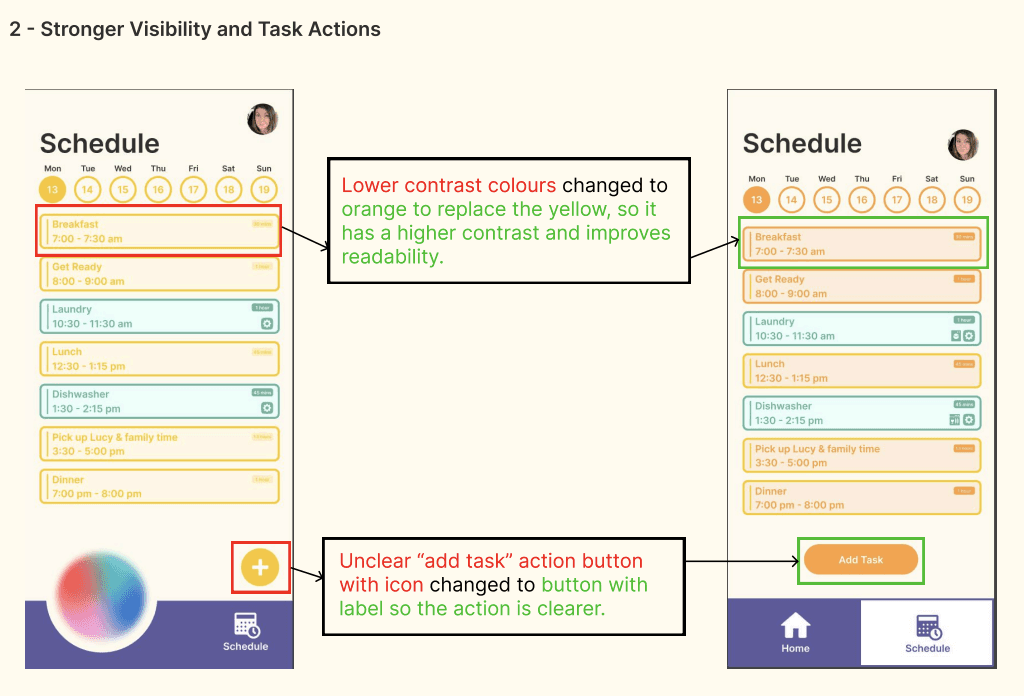
Unclear Interactions → Clear Task Placement
Flexible tasks were given their own section with explicit instructions, making onboarding faster and task identification immediate.
Low Contrast → Stronger Visibility
Orange replaced yellow across key action elements, improving contrast and readability throughout.
This iteration balanced creativity with usability, resulting in a final design that felt both approachable and understandable for households managing unpredictable routines.
FINAL DESIGNS
Flowry: The energy assistant that works around your life, not the other way around.
A routine-aware household energy app designed to help families shift flexible tasks to cheaper energy periods without disrupting comfort, childcare, or evening routines.
...built around three core interactions.
Energy Flow Scheduling
Users drag flexible tasks into energy flow circles representing cheaper periods. A Smart Choice option lets the app decide based on their schedule, reducing daily cognitive effort.
Flexible vs Fixed Tasks
The schedule view visually distinguishes fixed family routines from flexible energy tasks highlighted in green, with automation icons indicating which appliances can run automatically.
Personalisation & Household Preferences
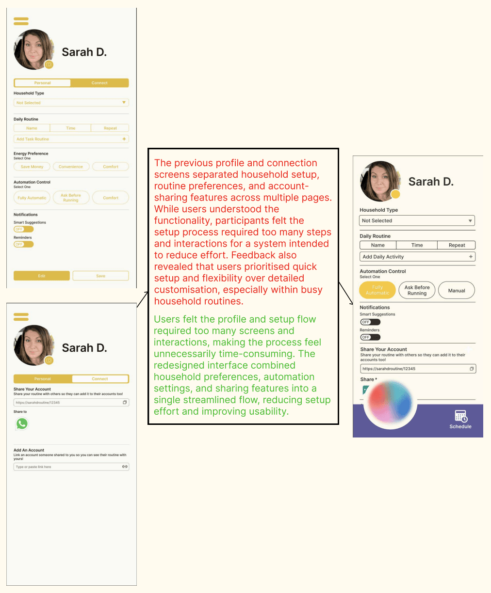
Users set household type, routine preferences, and automation comfort level. Shared coordination allows multiple family members to manage tasks together.
RESULTS
What the project achieved.
Flowry was presented as a fully prototyped, high-fidelity design at the end of semester and assessed across three criteria by the course instructor.
Criterion 1 - Design strategy responding to research
Distinction
Criterion 2 - Advancing and refining ideas through iterative design
High Distinction
Criterion 3 - Articulating the design process visually, written, and orally
High Distinction
Tutor Feedback
"Really great work this semester. It was especially great to see you responding to feedback and pushing the design of your home screen to be more tactile and inviting, I think you ended up with a unique and interesting UI. The settings page was also detailed and thought through."
One thing to carry forward.
The share feature reads clearly within the context of a live presentation, but would benefit from clearer in-app explanation as a standalone feature. A short onboarding tooltip or contextual label would solve this.
REFLECTION
What I learned.
Design for lived experience, not functional efficiency.
Early iterations focused too heavily on scheduling systems that technically worked but emotionally didn't. Real families needed guidance and reassurance, not another productivity tool. The tutor feedback affirmed this, the pivot toward a more tactile, inviting home screen was the right call.
Pivoting is part of the process.
Iteration 3 required abandoning significant work to rethink the core interaction model entirely. That willingness to start over when the evidence demanded it ultimately produced a more honest and distinctive design.
Context matters for features.
The share feature made complete sense within the flow of a live presentation, but feedback highlighted that it wouldn't be immediately understood as a standalone in-app feature. This was a valuable reminder that design decisions need to communicate independently, not rely on external explanation to make sense.
…and what I'd do differently.
Invest more in onboarding earlier.
Many usability issues stemmed from users not understanding the system on first use. Prioritising onboarding guidance from iteration 1 would have surfaced and resolved these issues faster.
Design features to stand alone.
For any feature that requires explanation, like the share function, I'd build in contextual labels, tooltips, or onboarding moments from the start, rather than leaving them as presentation-dependent decisions.
Test with a wider range of households.
A broader participant pool would have revealed how different family structures and comfort levels with technology shape energy-related behavior in different ways.