BIZFLASH.AI | PUBLISHED 2025
Rethinking Friction In Sales Learning
ROLE
UX/UI Intern
TIMELINE
July - December 2025
TEAM
2 Software Engineers
1 CTO
1 UX/UI Intern (me)
SKILLS
UX Auditing
Interaction Design
Visual Design
Prototyping
Developer Handoff
OVERVIEW
Making sales training feel less like a lecture.
As a UX/UI Intern at BizFlash.ai, I joined a small cross-functional team working on a AI-powered sales education platform, focusing on identifying usability issues and improving the clarity and responsiveness of key platform features.
UX Research
Conducting a full end-to-end audit across 3 core platform pages.
Interaction Design
Identifying friction points and proposing actionable improvements for each feature.
Visual Design
Redesigning components to improve visual hierarchy, feedback, and consistency.
RESEARCH & PROBLEM
What's actually getting in the way of users?
I conducted a UX audit across the Log In, Sign Up, Dashboard, Insights Library, and Leaderboard, reviewing each page before a single improvement was made.
No Visual Feedback
Buttons had no hover states, making it impossible for users to confirm they were clicking the right thing.
Identical Pages, No Differentiation
Log In and Sign Up looked nearly identical with no visual cues to distinguish them.
Cluttered Dashboard
The nav bar consumed too much space, alignment was inconsistent, and greeting copy repeated across pages without adding value.
Confusing Progress Indicators
The Leaderboard featured overlapping trackers and percentage indicators with no clear context, creating information overload rather than motivation.
Redundant Interactions
The Insights Library showed "liked" items without a clear distinction between saved and liked states.
Together, these issues pointed to a platform that looked functional on the surface but was quietly losing users' trust at every interaction. This led to the HMW statement of:
"How might we improve the clarity, responsiveness, and usability of BizFlash's core features so new users can get value from day one?"
AUDIT & FINDINGS
Finding the friction before fixing it.
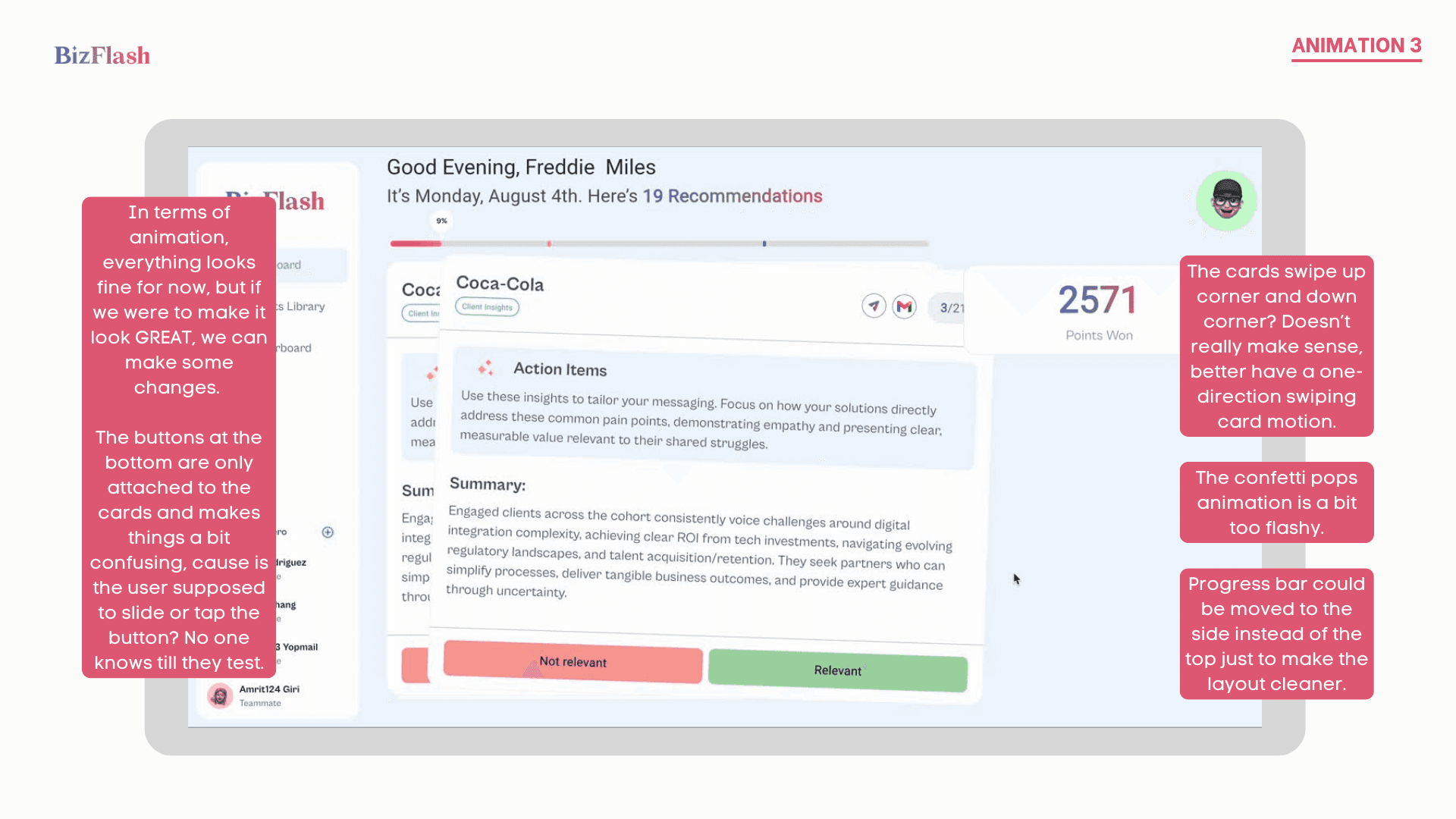
I worked through each page systematically, annotating every usability issue with context and a proposed solution. Each finding was documented as a slide deck, shared with the CTO and engineering team to align on priorities before any design work began.




DESIGN DIRECTION
We designed for clarity before we designed for delight.
Every proposed change was grounded in one principle, remove the friction that stops users from trusting the interface. Before any visual redesign, I made sure each recommendation was practical enough to implement without a full rebuild.



PROPOSED IMPROVEMENTS
Turning findings into fixes.
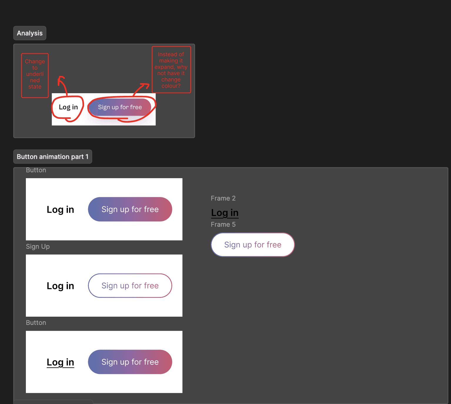
With the audit signed off, I worked closely with the engineering team to translate each finding into a concrete design recommendation, prioritising changes that would have the highest impact on user trust and clarity without requiring a full rebuild.

Log In & Sign Up
Shifted the tone from transactional to inviting. "Log In" became "Welcome Back" and "Sign Up" became "Let's Create an Account." Proposed hover states and button animations across all interactive elements.

Dashboard
Recommended collapsing the nav bar to give more space to the core content, and replacing static greeting copy with dynamic motivational statements that adapt to user progress.

Insights Library
Proposed removing the ambiguous "Liked" state and replacing it with a clearer saved vs. highlighted distinction, using a star or thumbs up function.

Leaderboard
Reduced overlapping progress indicators to one clear tracker, replaced the inaccessible glowing highlight with a fixed "Your Current Rank" bar, and made the Awards section collapsible.
FINAL DESIGNS
BizFlash: The sales platform that gets out on its own way.
A redesigned platform experience built on clarity, visual feedback, and reduced friction across every core user flow.
…built to onboard users fast, and keep them coming back.
Every change was designed so new users could understand the platform immediately, and returning users felt rewarded for their progress.
REFLECTION
What I learned.
Small changes, big impact.
A hover state is not a cosmetic detail. Across every page, the absence of visual feedback was making users uncertain. Fixing that one thing changed how the entire platform felt.
Design within constraints.
Working alongside developers taught me how to prototype changes that were practical to implement, not just ideal in Figma.
…and what I'd do differently.
Test with real users earlier.
The audit was heuristic-based. Running even two or three usability sessions first would have sharpened which issues deserved the most attention.