UTS | INTERACTION DESIGN STUDIO PROJECT 2026
Designing Trust Into Community Transport
ROLE
UX/UI Designer
TIMELINE
February - May 2026
TEAM
7 UX/UI Designers
SKILLS
UX Research
Usability Testing
Accessibility Design
Prototyping
Presentation Design
OVERVIEW
What if the hardest part of getting around wasn't the trip, but trusting the system to get you there?
As a UX/UI Designer on this project, my role was to make community transport feel less like a system and more like a service older adults could actually trust.
Field Research
Ran interviews and heuristic evaluations with SECC clients to surface real barriers, not assumed ones.
Accessibility-Focused UI
Rebuilt navigation, wording, and touch targets around users with low digital confidence.
Prototype Auditing
Tracked feedback from usability testing through to final implementation across five sprints.
RESEARCH & PROBLEM
Older adults aren't resistant to technology. They're resistant to being confused by it.
We opened with Lean UX assumption mapping and proto-personas, then tested those assumptions through heuristic evaluations and a field study with SECC clients.

Calling Beats Clicking
Most users defaulted to phone calls over apps, not out of habit but out of certainty.
Repetition Builds Trust
Confidence came from familiarity with a system, not from how advanced it was.

Comfort Hides In Small Things
Vague wording and cramped touch targets caused more hesitation than the booking process itself.
The Market Solves The Wrong Half
Products like Uber Seniors and Liftango nailed accessibility or logistics, but rarely both, and none supported the kind of recurring, community-based trips SECC clients needed.
What this told us: the problem wasn't capability. It was whether the system gave people a reason to feel sure of themselves. This led us to this HMW Statement:
"How might we design a transport booking experience that builds trust for low-digital-literacy users, without stripping away the human support they still need?"
STARTING WITH ASSUMPTIONS
We mapped trust before we mapped screens.
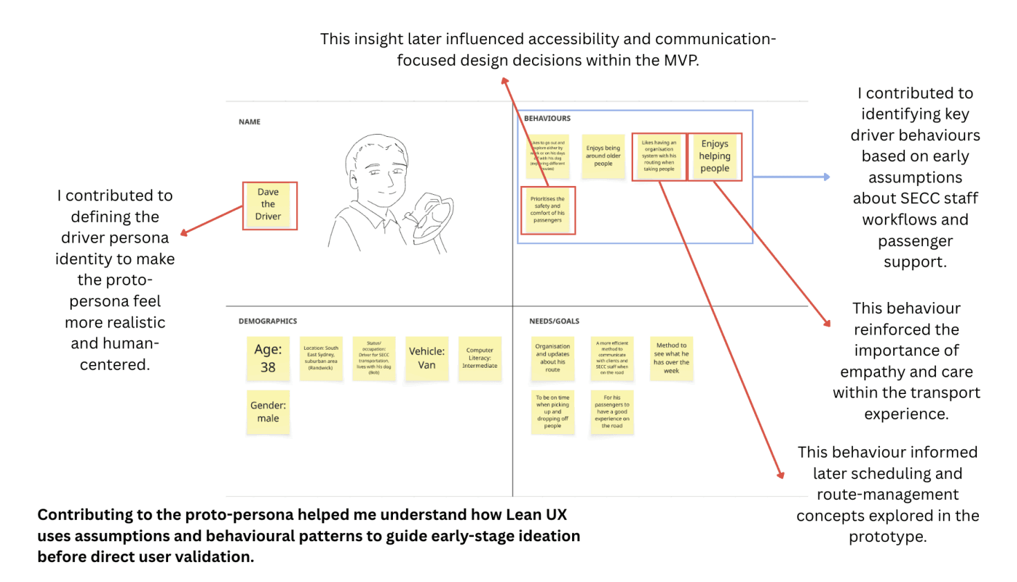
Assumption mapping came first, surfacing what we believed about accessibility, digital confidence, and communication gaps between SECC clients, staff, and drivers.
I helped shape the driver proto-persona early on, though the project would later prove that client trust, not staff coordination, was where the real design problem lived.
From there, reference research into Uber Seniors and Liftango showed us what accessibility features were worth keeping, and low-fidelity sketches turned that thinking into a first testable direction.


TESTING WHAT WE BUILT
Small issues broke trust faster than big ones.
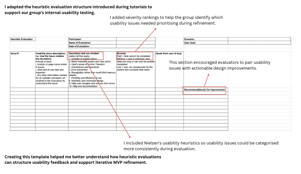
I built the heuristic evaluation template the team used to keep findings consistent across evaluators, then ran my own pass on the prototype. The issues weren't dramatic, they were small: confusing labels, tight tap zones, unclear feedback after an action.

As the design evolved, I also updated the empathy map and persona documentation to keep those frustrations visible to the team, and swapped in GoGoGrandparent as a stronger reference product built specifically around assisted booking for older adults.

LISTENING CHANGED THE DIRECTION
The interviews told us what the data couldn't.
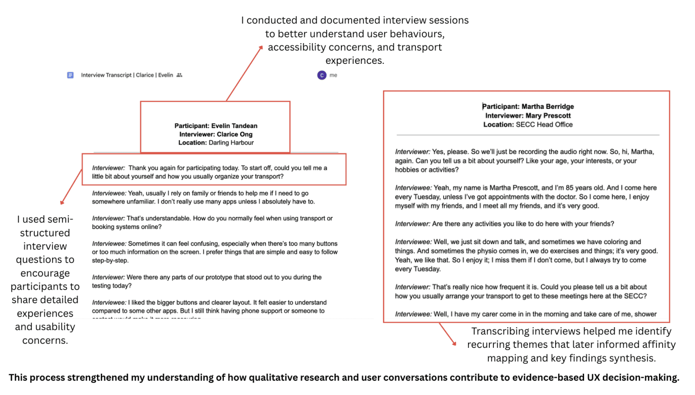
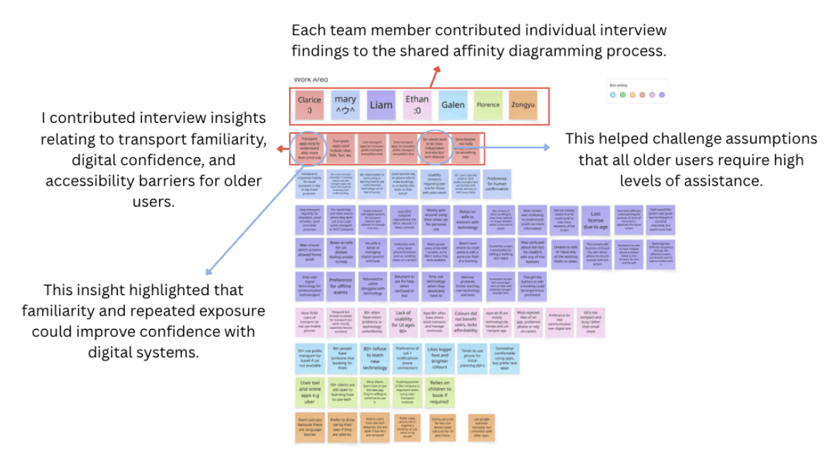
I interviewed a participant directly and transcribed three others, then helped synthesise the findings into an affinity map. The pattern was clear: users didn't want fewer features, they wanted fewer moments of doubt. That confirmed the pivot away from staff-side coordination and toward the client experience, trust had to be designed into the interface itself, not routed around it.
TIGHTENING THE EXPERIENCE
By this point, the work was about trust, not features.
With the core MVP settled, my focus moved to auditing the Figma prototype against feedback that had already been agreed on, making sure nothing slipped through unimplemented.

I also rebuilt the presentation template for visual consistency and recorded the voiceover for the MVP walkthrough.

THE LAST MILE
Small fixes, final polish, and a case for why it mattered.
Expert panel feedback flagged touch target sizing and rushed narration pacing. Both got fixed.

I also built the reference product analysis matrix used in the final presentation, positioning the product against competitors on accessibility and information clarity, not just features.

FINAL DESIGNS
SECC Transport: Getting there shouldn't require confidence you don't have yet.
A community transport booking system built for older adults and users with low digital confidence.
Booking, simplified to the essentials.
Large touch targets, plain-language steps, and a flow that never asks users to guess what comes next.
The interface disappears. The support doesn't.
Large touch targets and plain-language navigation do the heavy lifting, but the option to call SECC directly stays one tap away, so the system never asks users to trust it more than they're ready to.
Video help.
A built-in walkthrough for users who want a guide, not just a button.
Direct support call.
One tap connects users to SECC staff directly, no menus in between.
RESULTS
What the project achieved.
This project was assessed through a group MVP video and an individual portfolio with reflections.
Group MVP Video
HD (21.8/25, 87.2%)
Individual Portfolio & Reflections
HD (54.5/60, 90.8%).
Tutor Feedback
"This was a strong reflective essay supported by a comprehensive and well-organised folio…the portfolio was one of the stronger parts of the submission, clearly organised across all five sprints with a wide range of evidence demonstrating individual contribution."
One thing to carry forward.
My tutor noted that image numbering restarted across sections, making it harder to cross-reference between the reflection and the portfolio. It's a small thing, but a useful reminder that clarity for the reader is its own design problem.
REFLECTION
What I learned.
Assumptions are a starting line, not a shortcut.
We leaned on assumed user behaviour early to move fast, but some of those assumptions held on longer than they should have. Evidence should have entered the process sooner.
Small usability issues carry more weight for this audience.
A confusing label or a tight tap target isn't a minor annoyance for someone with low digital confidence, it's a reason to stop trusting the app altogether.
Feedback is easier to use when you stop taking it personally.
Expert panel notes on pacing and interaction clarity initially felt like a critique of finished work. Treating it as another iteration cycle, rather than a verdict, made it far more useful.
…and what I'd do differently.
Test earlier, even if it's smaller.
I'd trade a few polished assumptions for more frequent, lower-stakes user testing sessions earlier in the process.
Plan the crunch before it happens.
Our final sprint stacked video edits, prototype fixes, and script rewrites on top of each other. Clearer milestones earlier would have prevented that pile-up.
Keep numbering consistent from day one.
A minor fix, but one that would make the whole portfolio easier for someone outside the project to follow.