GRADSTACK.AI | CONCEPT 2025
Job Hunting, Minus The Dread
ROLE
UX/UI Intern
TIMELINE
March - October 2025
TEAM
1 Data Analyst Intern
1 Front-End Intern
1 Back-End Intern
1 UX/UI Intern
SKILLS
UX Research
Interaction Design
Visual Design
Wireframing
Prototyping
Information Architecture
OVERVIEW
What if job searching didn't feel like a chore?
As a UX/UI Intern at Gradstack, my goal was to design a graduate job platform from scratch for students, career changers, and employers within the internship period.
UX Research
Uncovering gaps in existing job boards through secondary research and competitor analysis.
Interaction Design
Mapping user flows and wireframes for three distinct user groups.
Visual Design
Developing a UI system that made job searching feel like browsing.
RESEARCH & PROBLEM
What makes up a job board?
I conducted secondary research on Australian job boards (specifically GradConnection, Seek, and LinkedIn) to understand where they were falling short for graduates.
The Designs Are Boring
Professional but generic, with no emotional connection for a younger audience.
Too Wordy
No filtering system to indicate who a posting is actually for.
Hard To Navigate
Dense layouts that leave users unsure where to start.
No Personalisation
No adaptation to a user's skills, experience, or career stage.
These insights pointed to a clear gap: that existing job boards were built for efficiency, not for the emotional reality of being a graduate navigating the job market for the first time. This led to the HMW statement of:
"How might we help graduates feel supported and guided in their job search, instead of pouring into an overwhelming, filter-free feed of job listings?"

DESIGN DIRECTION
I designed how graduates should feel, not just what they need to do.
Most job boards are built for efficiency, but efficiency doesn't motivate an anxious graduate. I mapped the emotional gap between how job boards make users feel versus how they should feel, and used that as a brief for every design decision that followed.
Currently feels…
Discouraging
Overwhelming
Unsupporting
Should feel…
Motivating
Guiding
Exciting

EXPLORING THE UI
What if a job board felt like scrolling through something you actually enjoy?
I looked at current UI trends and found the bento box layout suited the information perfectly. It's modular, scannable, and closer to browsing a feed you enjoy than trudging through a list.
I placed existing job boards side by side to validate that this direction filled the visual and emotional gap the research identified.

WIREFRAMES & STRUCTURE
Mapping three very different journeys into one cohesive platform.
I mapped out how students, career changers, and employers would each navigate the platform differently before moving into mid-fidelity screens.

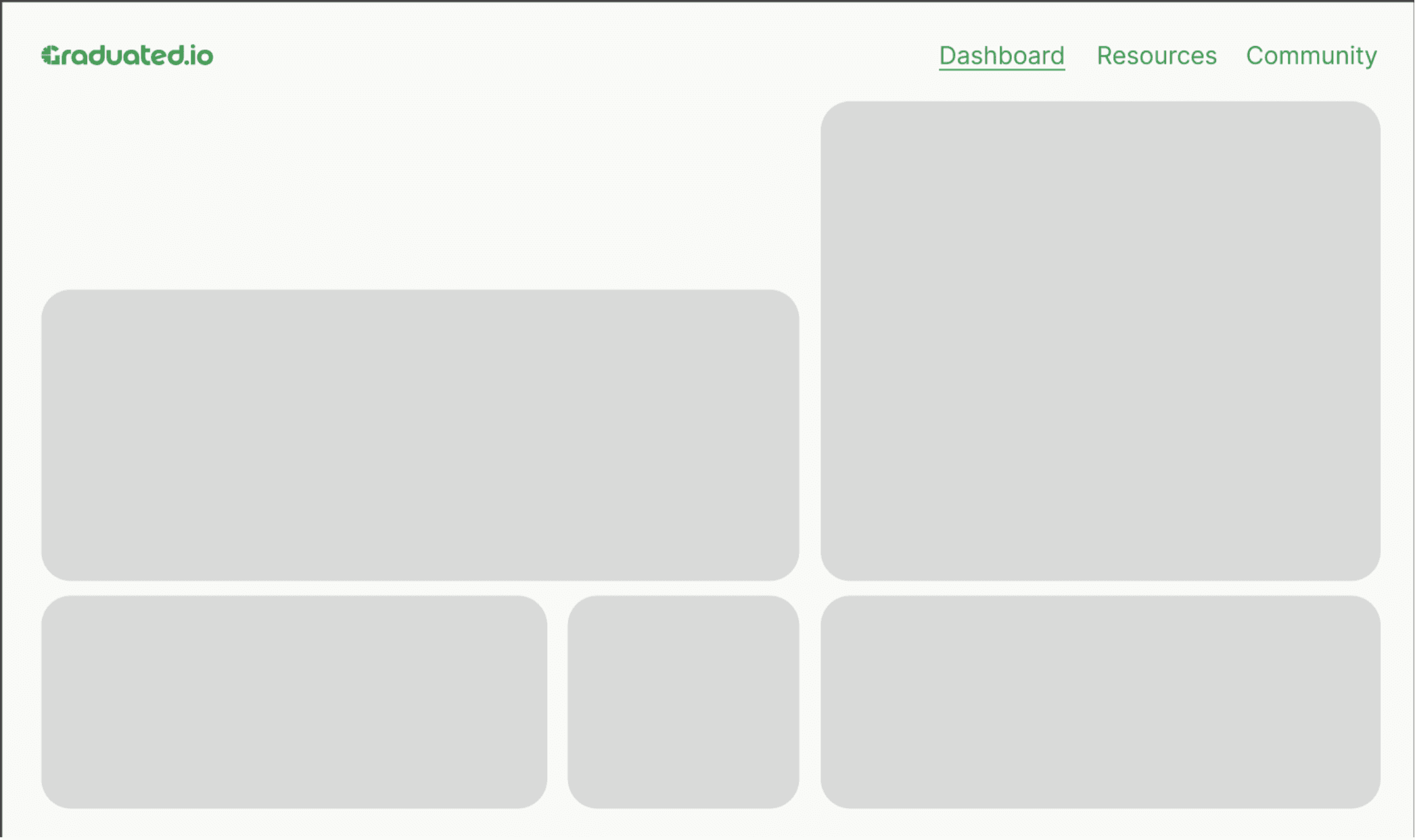
Starting with structure. Not style.
Before any colour or branding, I mapped out the core layout and information hierarchy for each page, establishing where users would land, what they'd see first, and how they'd move through the platform.

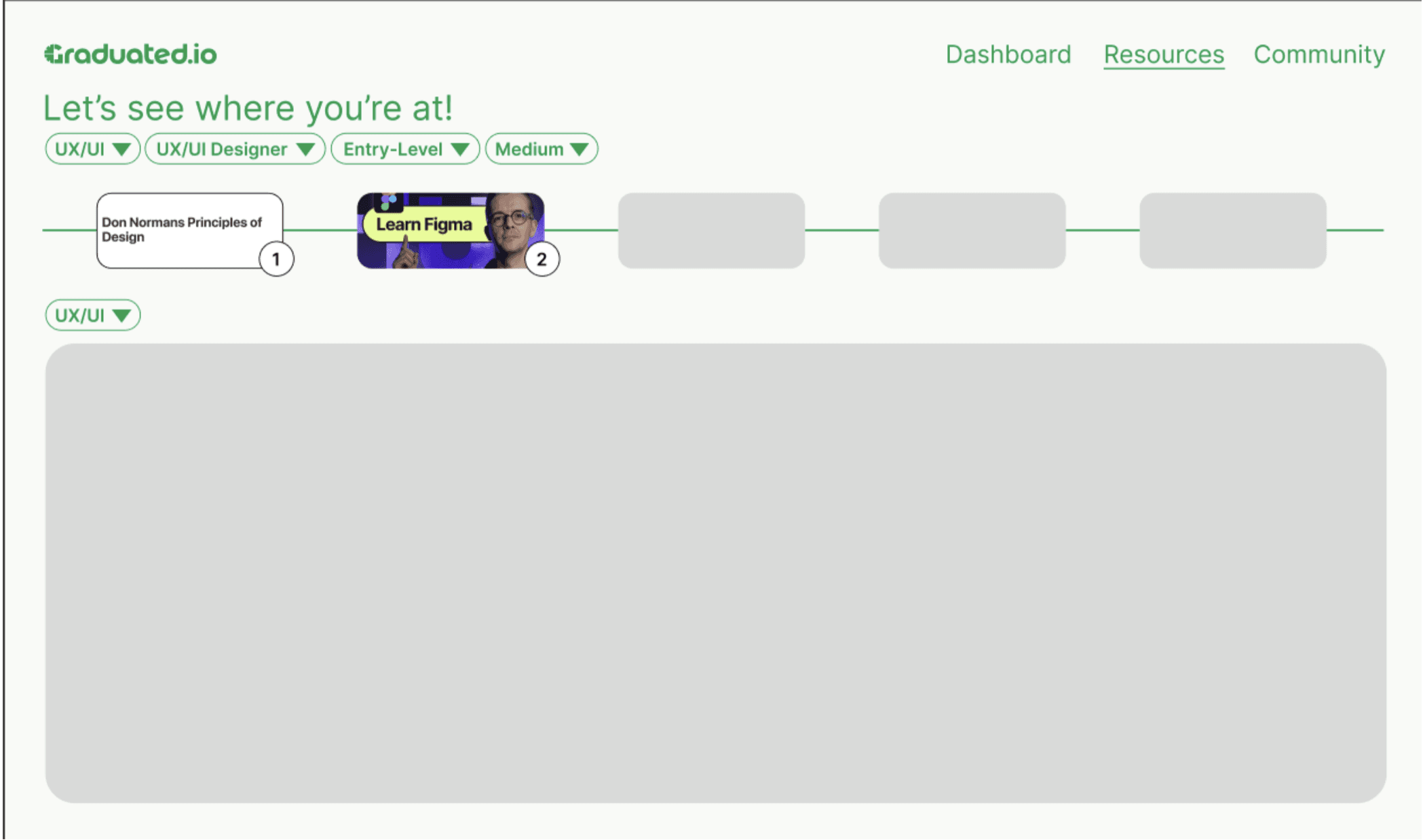
From job listings to learning resources.
The job seeker flow moved beyond just finding roles, the resources and learning path sections were designed to support users who weren't quite ready to apply yet, keeping them engaged within the platform.

A community built into the core.
Rather than treating community as an afterthought, it was wired into the navigation from the start, giving users a reason to return beyond job searching alone.
Three users. Three entry points.
Students, career changers, and employers each needed a different starting point and different information priorities. The wireframes established how the platform would serve all three without feeling fragmented.
FINAL DESIGNS
GradStack: A platform that meets graduates where they are.
A bento box job board, designed to make career discovery feel less like a chore and more like browsing.

…built for three very different people, in one place.
Students, career changers, and employers, each with their own needs, filtered into a platform that adapts to who you are.
One platform. Two paths.
Users can choose their journey from the start, entering as a Job Seeker or an Employer, with a tailored experience from the moment they log in.
Find your next opportunity.
Job seekers can search and filter roles by title, skills, location, experience level, and more, with a bento box layout that makes browsing feel less like a chore and more like discovery. They can also access curated learning resources to upskill along the way.
Your hub for peer advice and career growth.
Users can connect with the Gradstack community, posting questions, sharing resources, and tapping into a network of peers, career changers, and industry professionals.
Hi employer. Let's find your next hire.
Employers can log in to a dedicated portal, review top candidates ranked by overall score, and manage their talent pipeline in one place.

Your hiring data. Visualized.
Employers can track recruitment performance across job views, applications, interviews, and hires, with time metrics, cost per hire, and application source breakdowns all in one dashboard.
REFLECTION
What I learned.
Design for emotion first.
Efficiency alone doesn't motivate people. Understanding how users feel before deciding how they navigate led to better, more defensible design decisions throughout the project.
Constraints sharpen creativity.
Designing for three completely different user groups within one platform forced me to think in systems rather than individual screens, and made every component choice more intentional.
…and what I'd do differently.
Talk to users earlier.
I relied heavily on secondary research and emotional mapping. Primary user interviews earlier in the process would have validated assumptions before I committed to a design direction, saving iteration time later.